Monitoring Neo4j and Procedures with Prometheus and Grafana - Part 2
· 20 min read
This is the second of a two post series on monitoring the Neo4j graph database with popular enterprise solutions such as Prometheus and Grafana. Monitoring the status and performance of connected data processes is a crucial aspect of deploying graph based applications. In Part 1 we have seen how to expose the graph database internals and custom metrics to Prometheus, where they are stored as multi-dimensional time series.
It is now time to query those metrics and render results in a beautiful, integrated Grafana dashboard. This will help you establish 24/7 monitoring and alerting of your Neo4j setup so that you can respond to operational events, get useful insights to develop faster and better solutions to any bottleneck or incident, maintaining stable performance and good health of your graph.
Get ready, we are going on a journey through a forest of metrics, chart types, panel configurations, and query tricks. Many examples and solutions tailored for Neo4j will help us keep the path, and eventually we are going to land on a great Neo4j Dashboard, as masters of Neo4j monitoring.
The Grafana Connection
Grafana is a popular and powerful open source time series analytics software. For production use we suggest you check out Grafana Cloud, a fully managed SaaS platform. For testing purposes you can proceed to install and run Grafana server locally (instructions here.
Grafana too, like Neo4j, has built-in support for Prometheus, so you simply need to add a Prometheus source. To do so, open the Grafana UI at localhost:3000/datasources, add a new source choosing Prometheus from the option list and fill in the Prometheus server URL (e.g. http://localhost:9090).
In order to verify that everything is working as expected, you can use the Explore page from the Grafana sidebar menu, choose the Prometheus data source and pick a query from the Neo4j namespace. The time series you picked should be rendered instantly in a beautiful chart, and you can even benefit from Grafana’s suggestions such as Time series is monotonously increasing. Fix by adding rate().
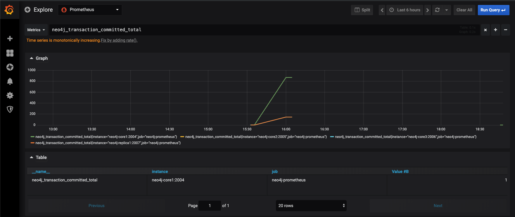
Query Neo4j metrics with PromQL in Grafana dashboards
Now everything is in place. Neo4j and our procedure expose metrics to Prometheus, which stores them, and Grafana queries them using PromQL. Prometheus Query Language allows to select, filter, aggregate and perform vector operations on time series data in real-time.
Following the documentation which can be found here and here, we are going to craft a new dashboard, one piece at a time. Start by creating a new blank dashboard using the plus button in the left bar. A new blank panel is added by default, and you can add a query to it.
Up
Let’s start with the most basic, but important query: up. Type up in the query editor, it will render as a line chart by default. If you didn’t remove the default Prometheus scrape configuration, the first thing you will notice is that there are two lines, one for each job (neo4j-prometheus and prometheus itself). Type up{job="neo4j-prometheus"} to see only the Neo4j job series. In Prometheus “every time series is uniquely identified by its metric name and a set of key-value pairs, also known as labels” (from prometheus documentation). job is a built-in label and we set its values in the YML configuration above.
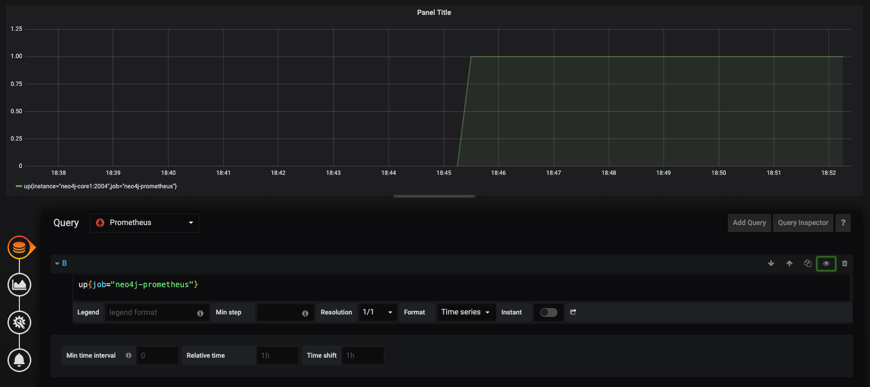
The Prometheus Up metric returns 1 if the instance is reachable, or 0 if the scrape failed. The resulting line chart is good in showing the time dimension, but not very suited for this kind of binary value. So go on to the Visualization tab (left side) of the panel editor and choose Singlestat visualization type, select Current from the stat dropdown, add some text mapping so that 1 becomes UP and 0 becomes DOWN. You can also colorize the displayed text by using suitable threshold levels such as 1,1.
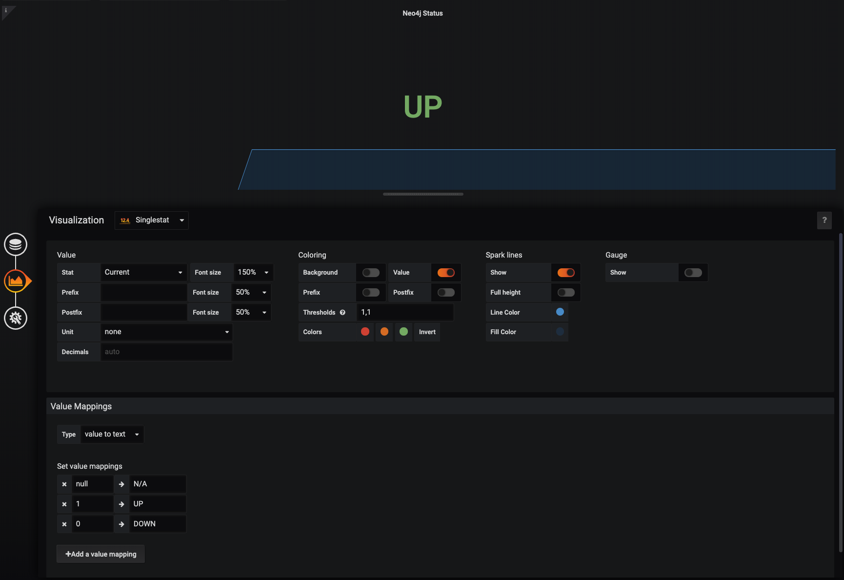
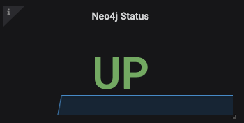
Now the result looks clear and shiny, and when you or someone else will open this dashboard in times of need, they will get the database status immediately. And if you want to keep the time dimension, just add a spark like to this visualization.
Counters
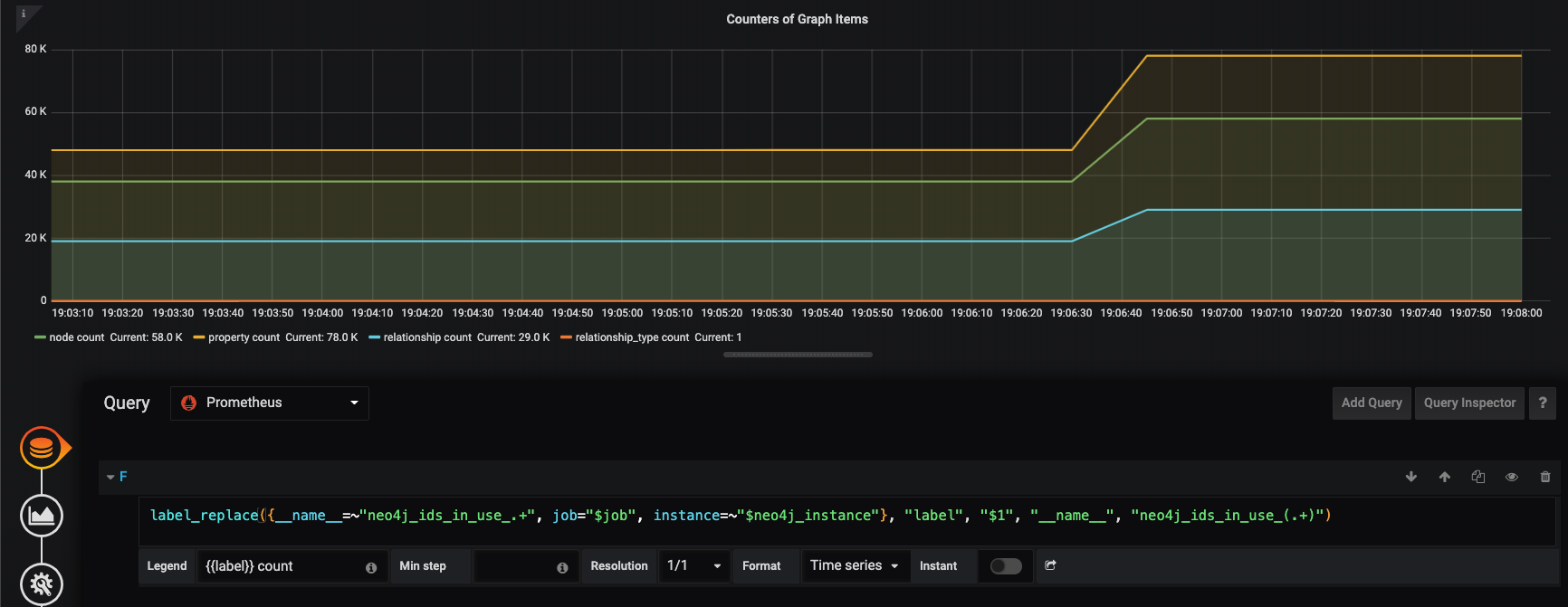
Let’s now add another basic query: a counter. Create a new panel and type neo4j_ids_in_use_node in the query editor (here the job filter is not needed since this metric is Neo4j specific). This metric gives us a good proxy for the total number of nodes stored in the database, which is something very useful to monitor. You will notice that when you add a query to a visualization, the legend is not very readable, being something like metric-name{job="<job-name>", instance="<instance-id>"} by default. You can easily display the metric name only using the built-in __name__ label, by typing `` in the legend template field.
Note that you can inspect all the available labels by using the Query Inspector on the right side of the query panel. If you expand the result object you will find the metric object, looking something like this:
"metric": {
  "__name__": "neo4j_ids_in_use_node",
  "instance": "localhost:2004",
  "job": "Neo4-Prometheus"
}
Now we could create similar panels to add the other metrics from ids_in_use namespace, which includes relationship, relationship_type, and property counts. Or we can create new queries within the same panel, which would result in three more series - three new lines - and Grafana will automatically assign different colors to each. Either of these options is good and gives you full control over each query. But there is also another way to get multiple metrics in the same chart, by using regex expression matching in metric names, leveraging their namespace structure. Syntax for this is very straightforward: {__name__=~"neo4j_ids_in_use_.+"}.
Legends
You can go even fancier with legends using Prometheus’ label_replace() function and rewriting your query like this:
label_replace({__name__=~"neo4j_ids_in_use_.+"}, "label", "$1", "__name__", "neo4j_ids_in_use_(.+)")
This will provide you with a new variable called “label” which you can use in your legend template, filled in with the second capturing group in the last regex. So, using ` count will print Node count, Relationship count` and so on, for each metric. Note that this new field is also visible in the metrics object revealed through the Query Inspector.
This is not vital, of course, but cleaner charts are more readable. For the same reason, another good addition is to display the current value of each metric directly on the label itself, so that users do not need to check the y-axis or hover the mouse at the last point to find out. To achieve this, go to the Visualization tab, in the Legend fieldset, and turn on the Current value from the options.
Derive new dimensions from existing metrics: Speed
PromQL has many useful functions which let you manipulate your metrics for your needs, see the complete list. An extremely useful one is irate, which will calculate the “per-second instant rate of increase of the time series” in a chosen range. So, given our instant vector neo4j_ids_in_use_node, we can get a range vector by simply appending a time range. neo4j_ids_in_use_node[5m], for example, will select the values of the counter metric within ranges of five minutes, according to the actual function used on the range vector (range vector can indeed be rendered only using functions).
We can pass the 5-minutes range vector to the instant rate function with: irate(neo4j_ids_in_use_node{job='$job'}[5m]), and get a nice representation of the per-second variation of the total number of nodes in the database, or in other words, the node creation speed.
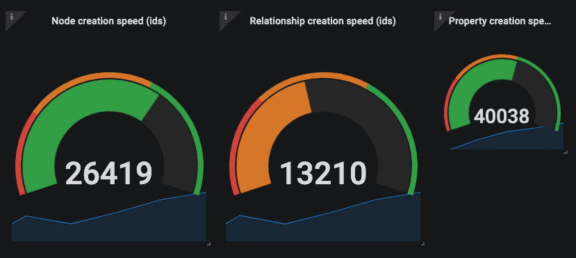
Now speed calls for Gauge, right? Not a problem using Grafana built-in Gauge visualization! We will not go into details since the configuration is pretty straightforward. If you care about ingestion speed, one important advice is to choose meaningful thresholds. To do so, you should test your Neo4j setup in a production-like environment, detect the maximum speed and set thresholds accordingly. Remember to invert the colors, because red is when the database is slow :) Repeat the same steps for relationship and property creation speed, and you’ll have a complete dashboard for your Neo4j racing car!
Bolt queue length using operators
PromQL operators can also be very useful because you can perform arithmetic, comparison and logical operations with vectors. Take for example Neo4j bolt metrics. neo4j.bolt.messages_received returns the “total number of messages received via Bolt since this instance started”, and neo4j.bolt.messages_started “tracks how many of the received messages have been taken on by a worker thread” (see Neo4j manual). So, every time a new bolt message is received by the database, it can start or be paused waiting for a thread.
Neo4j provides a specific metric to monitor “the accumulated time messages have spent waiting for a worker thread” (neo4j.bolt.accumulated_queue_time), but it is also interesting to monitor the length of the message queue: how many bolt messages are waiting? Well, you can plot the difference between the two vectors neo4j_bolt_messages_received_total - neo4j_bolt_messages_started_total and you have the bolt queue length!
In this case, you might even want to render the queue line on top of the counter lines, and since they are on different scales, you can use a nice series override (from the Visualization tab). We suggest to increase the line width and assign the queue series to the right y-axis scale.
Filtering with Grafana variables: $job
Ok, we know how to query Neo4j metrics with PromQL and render them in Grafana. Until now we focused on a single job, but one of the big advantages of Grafana is the possibility to combine many different jobs in the same dashboard. As an example, we can imagine having three different environments: development, stage, and production, each with Neo4j reporting statistics, each with a prometheus.yml file defining a scrape job. In this case, the time series are totally time-independent from one job to another, since what happens at a specific point in time in production has nothing to do with what happens in the same moment in development, or stage. So what we want to achieve is the ability to switch from one environment to the other, maintaining the same dashboard.
We have seen that job name is automatically added as a label to each time series, but we don’t want to duplicate our queries manually. What we need is a variable. In Grafana go to the dashboard settings, under the Variables tab and add a new variable. Give the variable a name such as neo4j_job and pick a type. Here we have 2 options. We could create a custom variable and hardcode the values of our job names, or better in this case, we could use one of the query-functions that the Prometheus datasource plugin for Grafana provides us: label_values(label).
So, select Query type, select the Prometheus data source and type label_values(job). At the bottom of the variable page you can see a preview of the values generated. As you can see, there is also the Prometheus job itself, but since we only want Neo4j jobs here, we can add a simple regex like /neo4j/ to filter out the others.
Grafana displays variables as dropdown filters at the top of the page, automatically. But to make our new filter work, we need to bind the queries to it using the $ symbol. Our up query would look like this: up{job=”$neo4j_job”} and we can use `` in legend templates. In this way, we can easily switch between Neo4j environments, and all the panels would re-render with the chosen environment data. Neat!

Since we are on the multi-job topic, remember that Grafana has the ability to manage multiple data sources, so it is very possible to monitor Prometheus and non-Prometheus metrics in the same dashboard. This is very useful when you want to monitor side-by-side some other processes, which are connected to Neo4j in your platform, and which export their metrics in other systems already.
Filtering with $instance and other tricks for Neo4j cluster dashboards
If Neo4j is running in cluster mode, you will have different machines. In order to collect statistics from all of them, each Neo4j instance must be configured to publish its own Prometheus endpoint, and the scrape job in prometheus.yml must be edited with a target list including all the endpoints. For example, our test configuration looks like this:
- job_name: 'neo4j-prometheus'
    static_configs:
      - targets: ['neo4j-core1:2004', 'neo4j-core2:2005', 'neo4j-core3:2006', 'neo4j-replica1:2007']
This will reflect in the instance label provided by Prometheus. If you do nothing, you will have one series per instance for each metric. This might be exactly what you need. But if you want to filter by instance, simply repeat the steps above and add a label_values(instance) query variable and a suitable regex to populate a neo4j_instance variable.
You can enable Multi-value and Include All options as they are very useful. Just remember that Grafana converts labels to regex compatible strings in this case, so you need to use the =~ syntax, such as {instance=~"$neo4j_instance"}.
While the default line chart supports multiple time series, this is not true for singlestat or gauge charts. If you want to keep those, either you set them to a specific instance, or you can use the Repeat feature of Grafana to multiply them dynamically based on the variable selection. Our initial status singlestat panel is a good example. It doesn’t work with multiple instances, and it is not meaningful with only one, since we want to know the status of the full cluster.
Open the panel editor and go to the third tab called General. Fill in the Repeating section with the newly created instance variable, and other settings as you see fit. Now update the query in order to support multiple instances, like this up{job='$job', instance=~"$neo4j_instance"} and go back to your dashboard. Now you can change the instance dropdown filter on the top, and when you select all, or multiple, your status panel will repeat accordingly.
Neat, but all panels looks the same and there is no mention of the instance tracked. Well, we cannot use Prometheus labels in panel title or in the prefix/suffix of the single stat chart, but we can use Grafana variables, so if you add $neo4j_instance as a prefix template in the Visualization tab, you’ll get exactly what you needed: each panel would have the tracked instance stamp on it!

Get the leader!
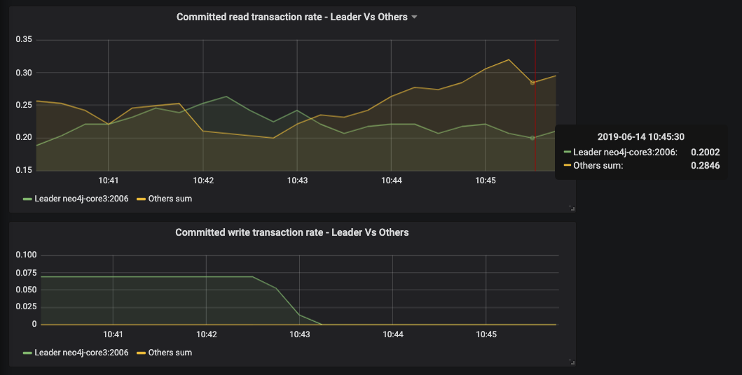
If you have a Neo4j cluster, you can also take advantage of the specific causal clustering metrics. Instances in a Neo4j cluster can have three different roles: leader (only one at a specific time), follower (in the core group together with the leader), and read replica. Even if the leader can change depending on core elections, one common feature request for monitoring is to plot the current leader only.
Our starting point to achieve this is the boolean metric called neo4j.causal_clustering.core.is_leader. Let’s create a new Grafana query variable with the following details:
query: query_result(neo4j_causal_clustering_core_is_leader == 1)
regex: /instance=\"(.+)\",/
Query_result is another candy offered by the Grafana Prometheus plugin, which can return results of a query. We combine it a Prometheus comparison operator, which by default act as a filter on the time series, and with a suitable capturing group regex. This will return the instance of the leader and store it in a variable.
Now let’s say that we want to display the number of active transaction for the leader. We could use a query like this: neo4j_transaction_committed_total{job="$job", instance="$leader"}, maybe pairing this up with it’s “opposite” neo4j_transaction_committed_total{job=”$job”, instance!="$leader"} to identify the followers and replicas’ transactions.
Custom timer metric as a histogram
In Part 1 we took all the effort to publish custom metrics, and we should render them! You got the hang of counters, so let’s focus on the timer.
Timers are great because you can measure time performance of any method of your custom database logic. For example, you can think of a scenario where data is ingested in Neo4j from some event processors queues or other sources. In this case, you would enforce your graph model in some middleware, where you could for example have a method which splits the original events into nodes and relationships for speeding up transactions and limit write locks, based on your data model. With a timer metric you could monitor how long this method takes to execute, and you could control what level of detail to include, for example adding some business categories as a Prometheus label to be leveraged in queries. This could be the category of entities, or the category of event source for example.
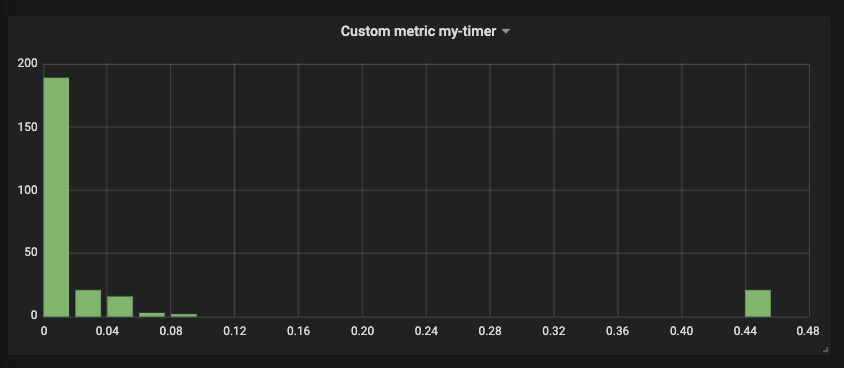
The timer metric returns quantiles. As you can see from the output in the custom metric section of our previous post, a 0.5 quantile with a value of 1.3296
means that for the 20 runs (_count) of the monitored procedure, in 50% of the cases the method took 1.3296 seconds. This is the median of our timer.
Go on and add my-timer{job=”$job”} as a panel query. Each quantile will show up as a different line. Note that quantile is a new label you can use as you see fit. This visualization allows you to monitor the variation in size of these quantiles over time.
Another option is to build a histogram out of this metric. If you wish to do so go the Visualization tab and set the x-axis mode to histogram instead of time. The result will show the current state of the quantile distribution. On the x-axis you will have the values - how many seconds did your code take to run - and on the y-axis you will have the count - how many events happened with that timing.
Putting it all together
Following the examples we covered so far, you can create panels for all the Neo4j metrics you need, including the very important transaction metrics, page cache metrics, and don’t forget checkpoint ones either.
Most of the time the metric name would be just enough to render a metric, and you can pick a visualization from the many Grafana offers out of the box. When you need more advanced transformations, PromQL functions and operators can be extremely useful in getting the needed values, and Visualization options help you render those values in a meaningful and informative way.
Once you put all your panels in place, the result is indeed a beautiful Neo4j Dashboard, such as this one.
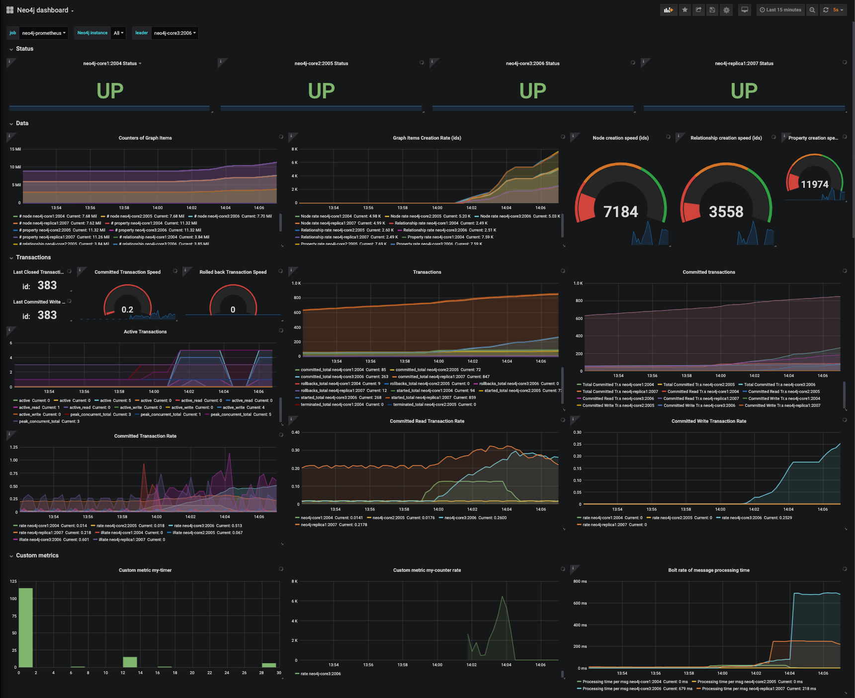
We published an example docker-compose project to help anybody testing this in no time. Simply clone the repository and type docker-compose up. The script will install in the main repository folder a Neo4j cluster of 3 core members and 1 read replica, Prometheus and Grafana. Everything is already set up to work out-of-the-box, including the provisioned dashboard. A really good starting point for experimenting! For more information read also our Causal Cluster Quickstart post.
Update: The example Neo4j dashboard used in this short series is publicly available on grafana.com dashboard sharing service, so it is even easier to import it in your own running Grafana instance.
Annotations and Alerts
Even if we called it that way, we don’t think there is a “perfect” Neo4j Dashboard for all use cases. Especially when it comes to custom logic, you need to tailor it to your needs. In this tutorial we shared some knowledge on how to do this. You also want to pick the internal metrics you are interested in, and avoid to show everything in your dashboard. But there are also other techniques to increase monitoring clarity and efficiency.
We will not go into any details on this, but it is important to mention that among the advantages offered by the Grafana/Prometheus monitoring solution there are also annotations and alerts.
Grafana lets users add manual annotation on time series charts, and includes a tagging system and the ability to add drop down filters. For example, after you change your custom database logic and re-deploy a new version of your Neo4j plugins, don’t forget to add an annotation, with “deployment” tag, and a note about the version or any other useful information. When you check out the dashboard again, it will be easy to spot the moment of change or to know what happened to justify a change in metrics trends.
Alerts are extremely useful for 24/7 monitoring and automation. You can set simple or complex rules, taking advantage of all the features of PromQL, to trigger alerts and send notifications through any kind of medium, including email, slack, Kafka queues, and many more. Both Prometheus and Grafana support alerts.
Conclusion
The Neo4j Graph Database is often a core component in complex architectures, providing graph features like traversing, path-finding, community detection, recommendations, and many more to other services and applications. For this very reason, it is even more important to monitor its status and performance. This is a key practise to enable good optimization, support proactive monitoring, and speed up incident recovery.
In this short series (part 1) we have seen how the many useful Neo4j internal metrics can be exposed to standard open source monitoring systems like Prometheus and Grafana, which in some cases are a preferable choice compared to ad hoc solutions. They not only have the ability to manage different processes and sources in one place, but also offer powerful query and graphical tools.
When you use general purpose tools some knowledge is needed in order to get specific insights for your graph database. So we showed some examples of how to use PromQL query language and Grafana panels to create beautiful Neo4j Dashboards.
Finally, we have taken the task of monitoring Neo4j one level up, showing how to publish custom metrics which enable to monitor your custom database logic. Here lies the true power of monitoring your graph database, since you can place side by side internals and business tailored metrics, and release truly useful insights.
Special thanks to all GraphAware experts and to David Allen - Partner Solution Architect at Neo4j - for their precious feedback on this topic.